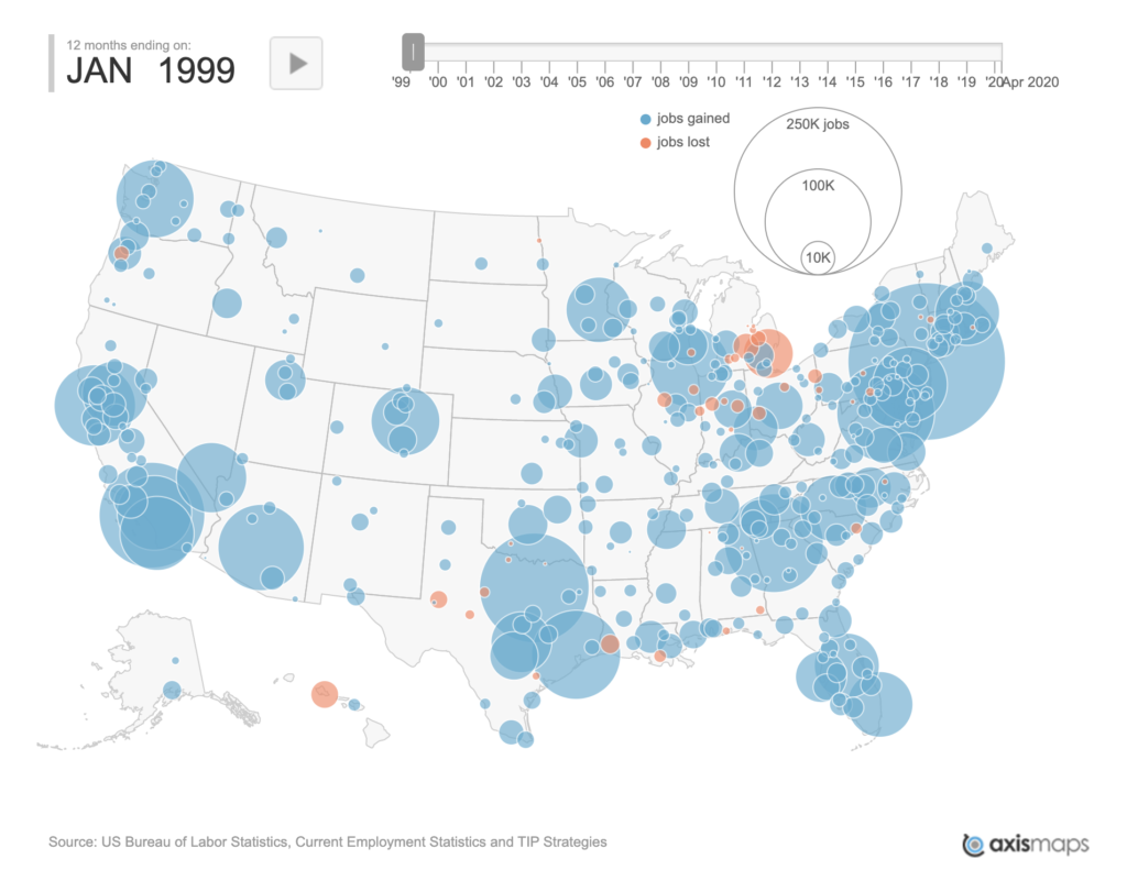
A new interactive map from TIP Strategies shows net job losses and gains over the last two decades, with red indicating losses and blue indicating gains. You may notice a rather sudden flash of red around 2008 and another in 2020. Wonder what happened there.