The second I see an infographic that is impossibly long and crowded with tiny numbers and illegible fonts, my eyes glaze over and I kill my browser window. If you want people to read and share your infographic, your readers can’t feel like they’re sifting through a proverbial junk drawer to find information. Here are three infographics that are chock-full of info yet easy on the eyes. Click the thumbnail images to see each infographic in its full-size glory.
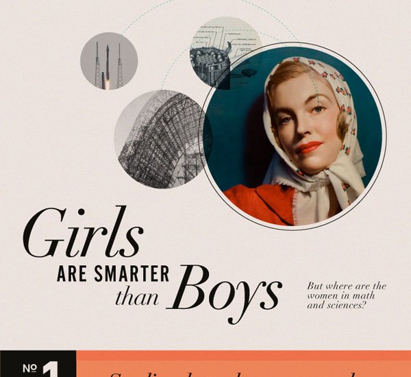
1. Girls Are Smarter Than Boys

Aside from the awesome subject matter and catchy headline, this infographic made the cut because its information is well organized and easy to read. It breaks the information down into three easy-to-find sections. Within each section, it uses a variety of charts and graphs to illustrate stats without being cluttered or overwhelming. The design is clean, the fonts look great together, and I love the look of the simple red-and-turquoise color palette paired with the vintage photos. Also, look at all that glorious white space!
2. 2012 Compensation Best Practices Report

Yawn — that title alone is enough to make you want to take a nap. This infographic takes a rather dull subject — compensation practices — and makes it look pretty damn exciting. The simple, stark color palette, black-and-white silhouette images, and clean fonts make me feel like I’m reading a graphic spy novel — learning about compensation almost feels exciting. This infographic also gives you a lot of information without looking busy or overcrowded, and it isn’t afraid of a little white space.
3. How Apple Is Revolutionizing Education

Lest you think I only like turquoise-and-red infographics, this one also has yellow and green. It also gives each stat its own graphic treatment — each stat is its own self-contained design, but they all work together to tell the same story: Apple is making a huge impact on education. The information is also well organized, and there is not so much going on that you feel like your head is going to explode. On top of all that, it’s just a pretty, pretty infographic — the colors and the simple icons just really look good together.
Another element that these infographics all share is that while their subject matter is not particularly interesting on its own, they all grabbed my attention, thanks to their unique, clean design and their ability to frame their information in a compelling way. Because ultimately, it doesn’t matter what your infographic is about — the magic’s in how you tell your story and present that story to the world.