Giant computer monitors, big-screen TVs and the high-resolution iPhone and iPad. These days, it’s HD everywhere you go. Technology, whether you like it or not, enables a more vibrant world and has made outstanding visuals the new norm. There’s no escaping it — the barrage on our eyeballs and minds is here to stay.
And politics is no exception. A candidate’s looks and manner is more important now than ever before, and that extends to every aspect of the candidate. No, I am not going to spend this blog post talking about Mitt Romney’s outstanding hair (though it is really fantastic). I’m aiming to get a little more symbolic.
LET’S TALK LOGOS
As a branding professional, I can tell you that a logo is hugely important — it’s the ultimate symbol for any brand. And it is especially important for a campaigning politician; after all, a politician can only be in one place at any given time. But a logo can be everywhere, all over the place, all the time. Candidates pour thousands into getting these logos to say exactly what they want to say and be a visual extension of their campaign platform. And this year, we’ve got two very different candidates vying for POTUS. Let’s see how they’re doing on the branding front.

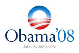
During the 2008 presidential election, Barack Obama’s iconic “O” set the new standard for a sleek political logo. With its clean, perfect circle containing a sunrise over a red and white landscape, this logo had the aspirational feel of all presidential logos — with a twist. The colors are brighter and lighter than many political logos, featuring sky blue over navy, and cherry red over crimson. Without knowing anything about Obama’s platform, you know this is a candidate who stands for hope and a new beginning. And though it was a politically risky move to equate a candidate with a symbol, it didn’t hurt him considering that, you know, he won. I’m not cynical enough to believe that a logo or a brand can be the only thing to propel a candidate to the top, but having such a new, fresh look while still keeping with the patriotic feel of presidential branding? Well, it didn’t hurt.

In 2008, the Obama campaign logo favored the clean, updated yet traditional serif font, Requiem. But the typeface everyone remembers from this campaign is Gotham. The Obama campaign’s use of this gorgeous sans-serif was so excellent, Gotham became one of the hottest fonts of the year. It’s new and clean and downright pretty. It’s bold. It’s everything a young African-American presidential hopeful could want to help him shake up the establishment. Fonts aren’t just lettering, they give soul to the words — and this type by Hoefler + Frere-Jones gave soul to Obama’s campaign. It’s nice to see it still in use this year. What can I say? It’s a great, clean look. Considering how introverted and some would say chilly the president can be at times, it is great strategy to have him associated with warmth through this simple, consistent look. The 2012 campaign logo maintains the 2008 palette, and I, for one, am glad. Consistent branding is better branding.
![]()
MITT ROMNEY

As you might expect, Mitt Romney’s logo is more traditional than Barack Obama’s. As he is an older candidate and former governor, it makes sense. And yet it’s clear Romney is competing with Obama not only on the campaign trail but also through his logo. Notice how they both feature white type on blue backgrounds (though Romney’s blue is much colder), and both use the first letter of the candidate’s last name in prominent ways. Romney’s logo is an answer to Obama’s in many ways. So what do I think of it? I think it’s pleasant, and I like the bold type — the Trajan serif is traditional without being too stodgy. With what Romney wants to achieve politically, I think it does a nice job. It evokes tradition and comfort. It’s not edgy, but nobody votes for “edgy” in a Republican president. I don’t like his tagline, “Believe In America,” though. It is undoubtedly aspirational, but it lacks substance — doesn’t every presidential hopeful believe in America? On the other hand, the Republican Party is known for upholding traditional family values and belief systems, so I can see where his tagline would resonate deeply with his conservative base.
AQUA-R-FRESH
Like Obama, Romney capitalized on the first letter of his last name and is using it as a symbol for his campaign. How convenient that “R” also stands for Republican. The “R” is supposed to look human, as if three Americans are standing shoulder to shoulder. It attempts to gently evoke an image like this one of togetherness and grandeur:
![]()
But it falls a little short. I am not the first person to notice that it looks like toothpaste. Beware, for once you see it, you can’t unsee it.

That “R” looks a little medicinal, though that may be part of his strategy since Medicare is currently his main election platform.
I give triple points to Aquafresh for being so patriotic in their own branding! Aquafresh, the American toothpaste.
Other comparisons aside, the “R” fails in really doing what it’s supposed to do, which is look like an “R.” Seems obvious, right? But if Mitt’s last name were “Omney,” I would believe it with this logo. I also have a problem with the kerning between the “E” and “Y” in “Romney” — it’s oddly dramatic and unnecessary to have the “E” and the “Y” mashed together that way. If I didn’t know how rigorous it is to make a logo, I’d call it an oversight. As it is, it just looks odd. But all in all, it’s not a terrible logo. I mean, it could look like this guy’s:

Anyone up for Asian fusion at a three-star hotel?
The good news is that a man is more than his logo. These logos represent ambitious, smart men vying to be the leader of this country. That earnest goal, and what they would do with that power, is more important than any slick branding campaignIt’s important, but it’s not everything. That said, Obama’s logo and branding are groundbreaking for a politician. Romney’s branding is traditional, inoffensive, and makes me want to brush my teeth. Plus, his hair is just so great! Now, go learn what these guys would actually do in office and let the voting begin!