Compelling stories and mind-blowing statistics are swell and all, but if they’re buried in a white paper or lost in a post somewhere in your blog archives, who’s going to see it? Who’s going to share it? Who’s going to care?
Maybe a few people. Maybe even several, but how much of an impact are you really making? Could you do better?
Maybe your content needs to go visual to really sizzle. Maybe you need to cut through the slog of black-and-white pixels with an eye-popping infographic.
White papers and blog posts are fantastic ways to get your message out there, but some stories can be made more memorable if you use visuals to tell the story.
Obviously, just putting a candy shell on some random statistics or lukewarm content isn’t going to add up to a winning infographic. Your content needs to tell a story that’s important to your audience, and the numbers need to be relevant to what you’re saying. And the design needs to be clean and easy on the eyes — your readers shouldn’t feel like they’re to find the unicorn in the Magic Eye image.
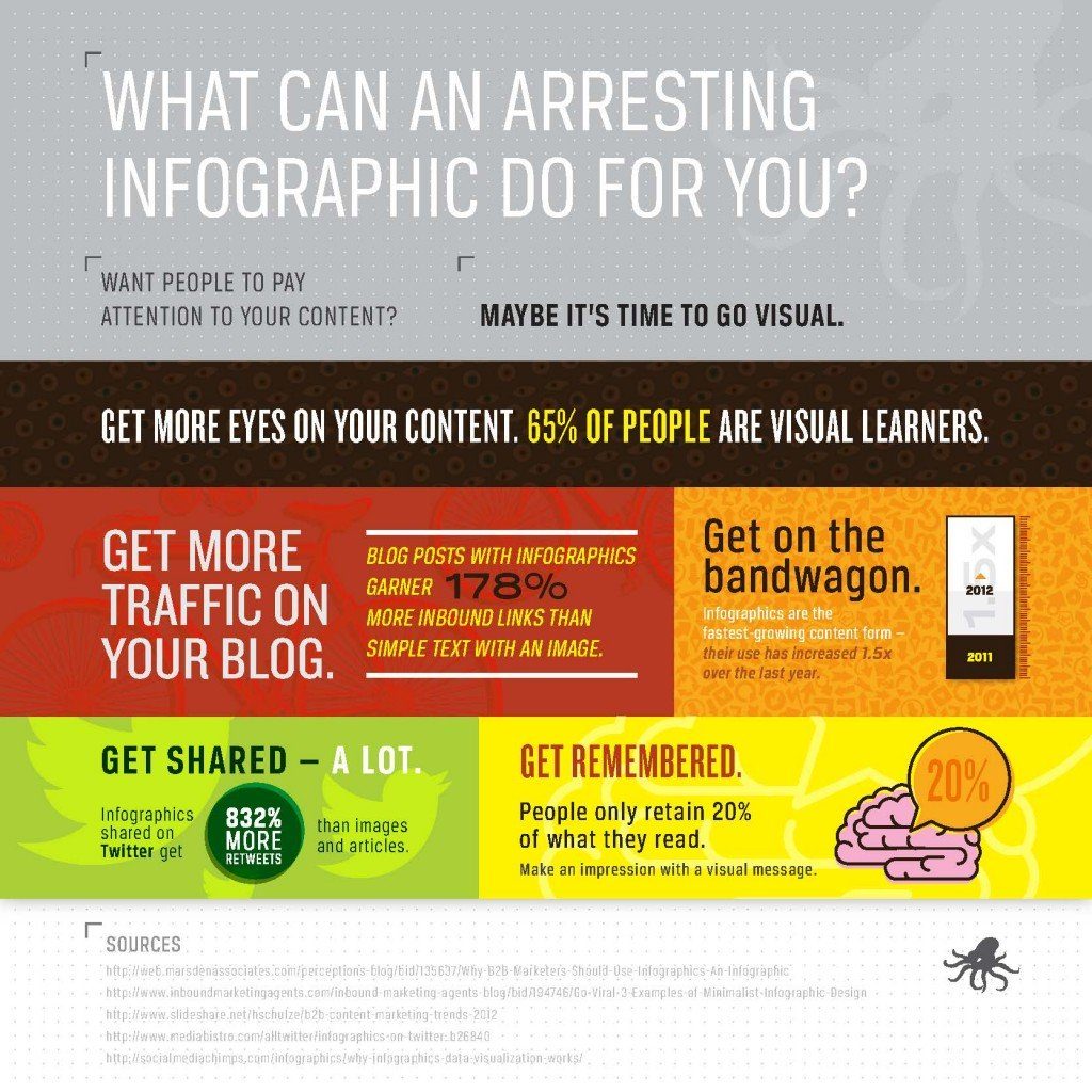
We like infographics so much, we’ve put together our own about just how effective and attention-grabbing they are.

We’ve got lots more to say about infographics this week, so stay tuned.