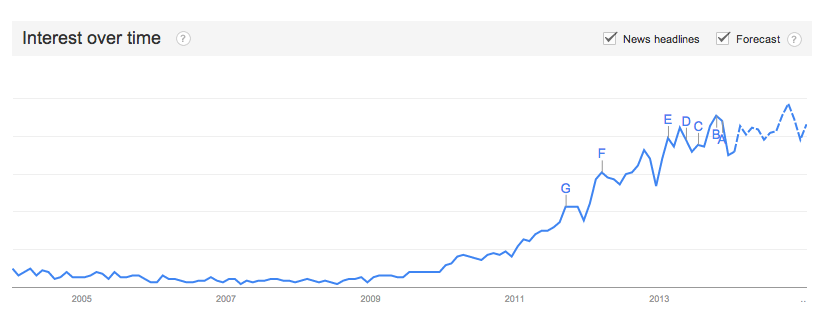
I often hear marketers assuming infographics as a content marketing tool are declining or will become irrelevant in 2014 (or soon after). But the art of visually representing data isn’t new, and, according to this Google Trends forecast (below), isn’t going anywhere soon.

The brain processes visuals in a unique way — with visuals processed up to 60,000 times faster than text. The good news about that is the content marketing trend of using infographics to get across potentially complex data or information isn’t going anywhere. The bad news is that increased processing speed is currently being used to determine, in record time, what infographics are worth our time and which are adding to the overwhelming trend of information overload.
And, if one thing is clear about infographics in 2014 and beyond, it’s that consumer patience for poorly done or irrelevant infographics is wearing thin. That means a poorly thought out, written, or designed infographic, at this point, is likely hurting your brand’s perception with your target market, instead of leaving a neutral or positive impression.
Here are our tips for how to keep your infographics relevant in 2014 and beyond:
-
What’s the point? Make sure you have a clearly defined strategy, measurable objectives, and a relevant message to get across to your audience before setting out on creating an infographic. Infographics created because they’re “all the rage” and you just “have to have one” are doomed to fail from the start. Instead, think about complex or data-driven messages you regularly send to the market that you could help decipher with a visual guide.
-
Focus on quality over quantity. If you could only market one infographic this year, focus on creating the go-to guide for that particular topic for the next year. Instead of pushing to “keep trying” or maintaining an attitude of “better luck next time,” focus on creating fewer, higher quality infographics for your audience.
-
Motion graphics can go a long way in data visualization. Can you earn or maintain interest by adding a video component to your infographic? This video (above) from AWeber Communications tells the visual story of the data in a compelling way, but they also provide a static version of the infographic here on their blog.
-
Interactive infographics can provide a unique experience. See an example of an interactive infographic in action here on The Starr Conspiracy’s website, “Consumer Tech Trends and Their Impact on Enterprise HCM Software.” The interactive components of an infographic can provide a unique and memorable user experience in a way that a static infographic just can’t do.
If you want to continue using infographics as part of your content marketing toolbox for 2014, by all means, go for it. There is still a lot of ground to be gained for those who get infographics right. But if you’re not sure you have all of the tools to get a successful infographic off the ground this year, give us a call.