Being the proud owner of multiple button machines, I’ve fabricated more than my fair share of round promotional items. In my eight years of button-making, I’ve seen a lot of great designs and a metric ton of absolutely terrible ones. When used as a promotional tool, your button is basically like your business card — it represents you and your brand. So why not put forth the extra effort to make your buttons look amazing? Here are a few pointers to help you avoid the most common pitfalls I’ve seen in my years as a buttonatrix. And these rules don’t just apply to buttons; whether you’re putting together a design for a shirt, a coffee mug or a business card, you need to pay attention to what you’re doing.
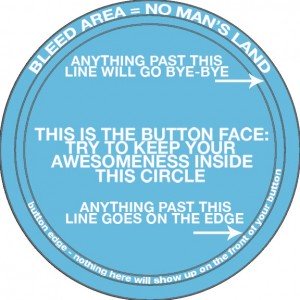
Know your template. First, let’s look at the anatomy of a button template:

Stuff you put in the bleed area is not going to show up on the front of your button. Some people don’t understand this, no matter how many times I tell them to keep their main design inside the innermost circle. Apparently, their design is so epic that it cannot be contained on the face of a button. And that’s too bad. All of their amazing text, lens flares, unicorns and kittens that go past that design edge line are going to get mercilessly guillotined.


Bigger is better. There is only so much room on the face of a button (usually 1 to 3 inches). Making the most of your real estate does not mean cramming as much crap and text onto the button as possible. Keep it simple. Large, bold text and simple, eye-catching artwork are your friends. Tiny text or super-fine, flowery script will not make your design awesome. Think Impact or Helvetica, not Ophelia Italic or ITC Edwardian Script. And while Comic Sans or Times New Roman might be fine for forwarded chain emails, they do not belong in your earth-shatteringly brilliant button design.
Make resolution your god. Regardless of your design’s aesthetic resplendence (or lack thereof), making sure your design is the proper resolution for print is paramount. Seriously. Forget about being a good person. Forget about sending your child to a decent college (there’s no shame in trade school). Get the resolution right. Just because something looks good on your screen doesn’t mean it will look good printed. Open your design in Photoshop. Go to Image > Image Size. Check that resolution. Is it 300 or higher? No? Well, then, your Amazing Button of WIN is going to wind up looking like this:

Years ago, someone sent me a design with a resolution of 43 dpi. What the hell am I supposed to do with that? That kind of resolution isn’t even good enough for the Internet, and the Internet, as we all know, has ridiculously low standards.
If you’re not “good at computers,” find someone who is. Maybe even pay them money to put together an eye-catching, properly formatted, high-resolution design. Your friendly, local button-maker may even be willing to design your buttons for an extra fee.
You’re already paying to have your promotional items manufactured. And you’re putting your name, brand and identity on these things. Go the extra mile to make them look nice. You’ll be glad you did when your unicorn doesn’t get decapitated.