
A new website from The Starr Conspiracy isn’t complete without hidden messages within the brand elements.
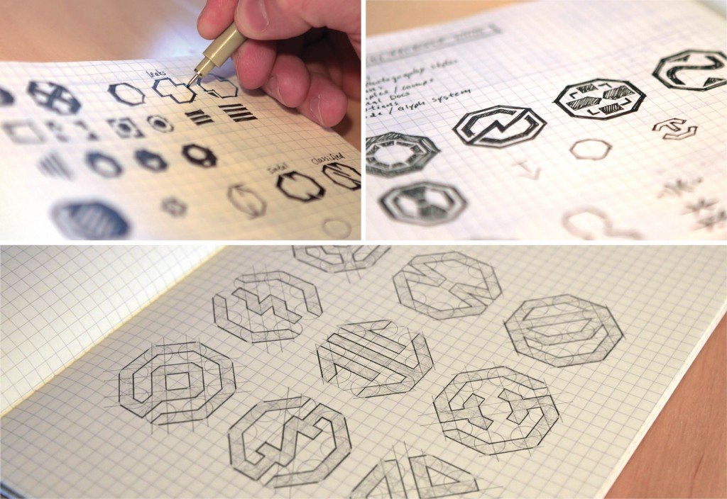
Our brand evolution has been an adventure over the last several months. Developing a concept for a new or updated brand takes time, research, and a lot of visits to the drawing board.
The brand also is an example of how our expansive Honeycomb model is put to work. We identified how our three main audiences — prospects, customers, and employees — would interact with the brand.
Level 1 access is public information, what we’re willing to share. Our current customers are Level 2, and employees are Level 3.
To illustrate this point, our creative agents developed an icon language. These icons are used in different ways with different audiences. For example, at Level 1 access which is publicly facing, we have Web icons. These icons have been designed with a very specific message behind each image. For example, “What We Do” is an icon with a door, offering a peak into the agency workings.
At Level 3 access, which only relates to agents of The Starr Conspiracy, we have department icons. These are also designed with a deliberate message behind each image. Our “Creative” icon has a notch in it, peeling away at the creative layers it takes to develop a concept, design, or brand.
We won’t be sharing all of the icon secrets here, but you can take a look, start to guess. What do you think each icon means?

Related articles


